

|
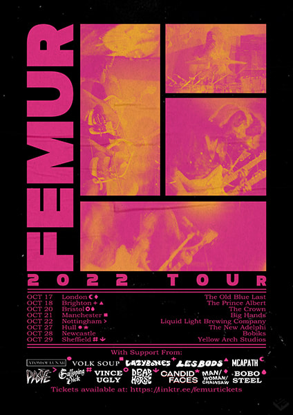
I recently had the pleasure of working with a Sheffield-based band, FEMUR, to create a range of promotional materials for their upcoming UK tour. The primary elements of this were a series of posters alongside a small range of merchandise, which would be available to buy during the tour.
The brief I received for the project was fairly loose, which the only restrictions being a general color palette of pinks and purples, alongside a photographic theme to the design. I was then provided with a series of images from which I could work, that had been taken during a live gig. The images which included all four members of the band were very few and far between, which initially sparked the idea to give each member their own 'tile'. Within these images were slight variations of the same stance, which allowed for the creation of a long exposure style image, linking back to the energetic style the band has become synonymous with. After organizing the composition of the tiles, I could then begin to implement the color palette that had been requested in the brief, which was achieved by adding a two tone gradient filter. |
|
|

|

|

|

|
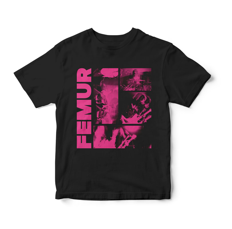
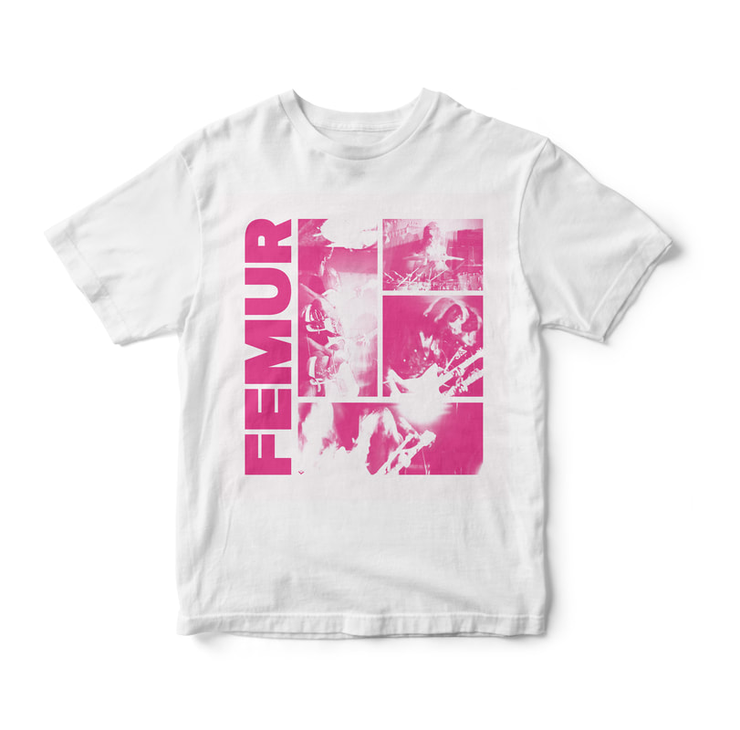
The below images show the two variations of T shirt that have been created. The primary graphic that also features on the poster has been toned down slightly to a monotone design. Which was done to reduce the print costs as much as possible to ensure the finished product could be sold at a reasonable price. Although on first glance the two t shirts seem to have the exact same design, on closer inspection you will find that the pink monochrome design has been used differently in each design. The black T shirt uses the pink graphic as the highlights within the images, whereas the white t shirt uses the same tone for the shadows. This was implemented in order to avoid the images having a 'negative filter'.
|
|
