

|
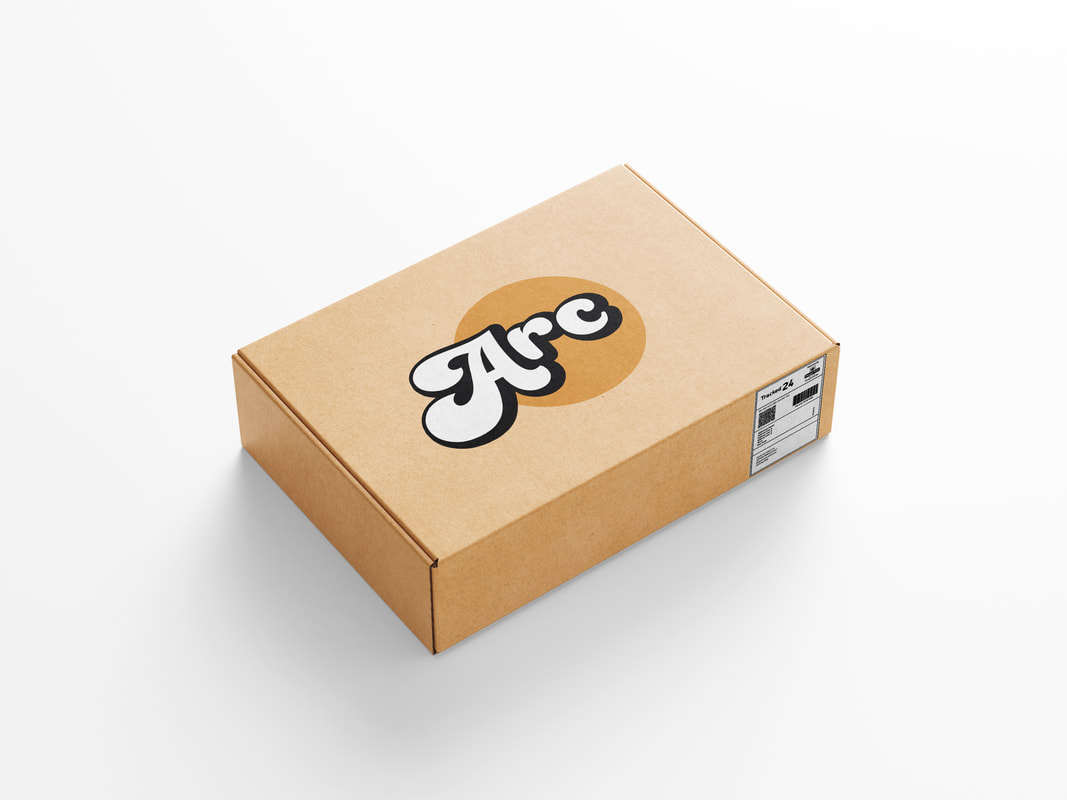
ARC is a company that buys and sells vintage clothing on online platforms. I was approached to redesign their existing logo and general social media graphics. This was because the company had grown away from the aesthetic they had previously portrayed.
As the company grew more towards a strictly vintage brand, the new logo would need to reflect this. This was the primary element of the brief, along with a bold new color palette. |

|

|

|

|
|
The design process for the new logo was a fairly quick, with only slight changes made to the first iteration.
As it would need to feature at a larger scale on packaging, and at a much smaller scale on social media and online selling platforms. This is why I chose to have the text in white, with a heavy stroke and shadow. However to stay within the brief, i chose a 70's script text, which i then made some slight changes to in order to emphasize the curves. I then experimented with different simple shapes set behind the text, in order to keep the logo legible at a smaller scale. Before settling on a circle, as shapes with sharper edges seemed to jar with the curved nature of the typeface. |
|
